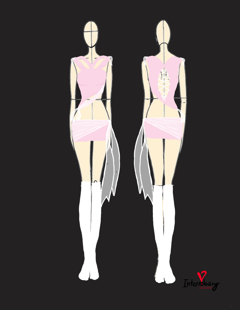
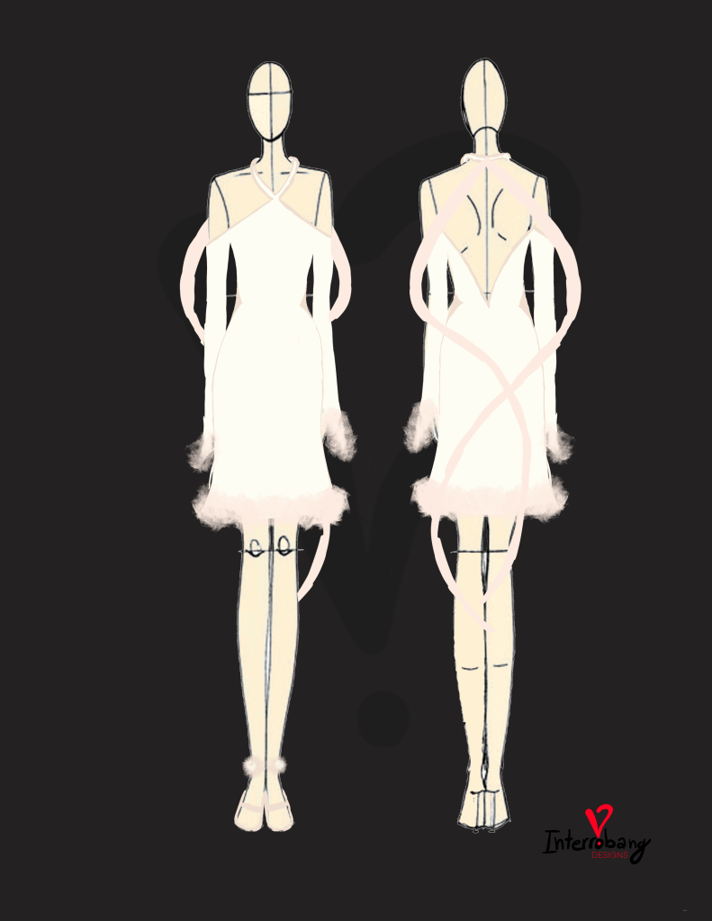
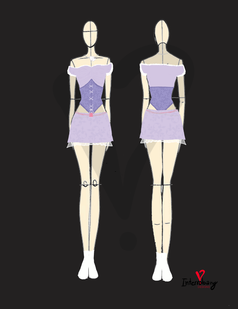
• You may notice this at the bottom of most of my designs in this “designer” portion of the website:

    This is my would-be-name for a fashion brand.

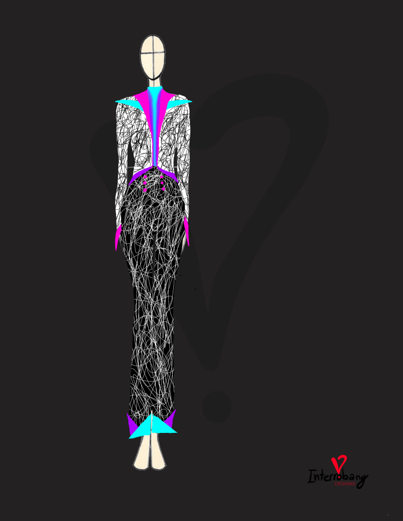
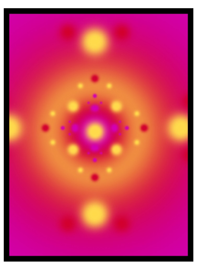
    and before I dive into the “why” let me show you my brainstorming word-vomit-cloud visualization of the brand.
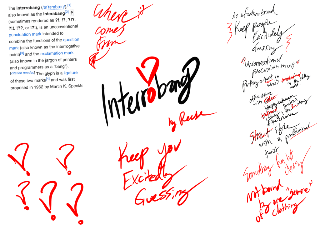
    An interrobang () is a nonstandard and unconventional puncuation mark combining an exclamation mark and a question mark into one. The various uses include ‘stating a question in an excited manner, expressesing excitement, disbelief, or confusion in the form of a question, or asking a rhetorical question.’

    That first use stuck with me from a very young age (I first learned about it when I was 8) and I’ve grown to want to embody the idea of keeping people ‘excitedly guessing‘ what I’ll do next. If I were to create a fashion brand I’d want the wearer to feel that same idea.

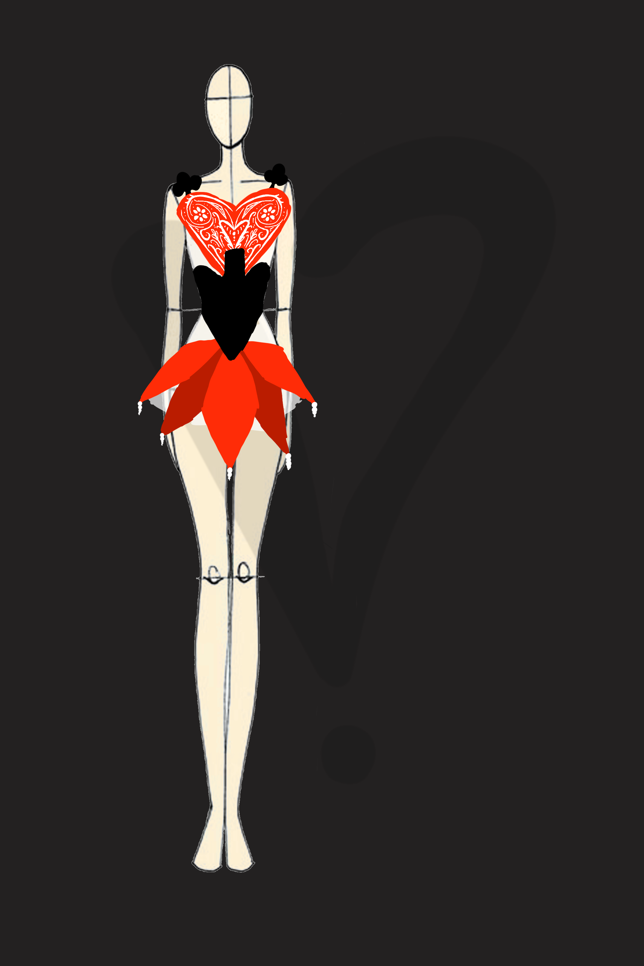
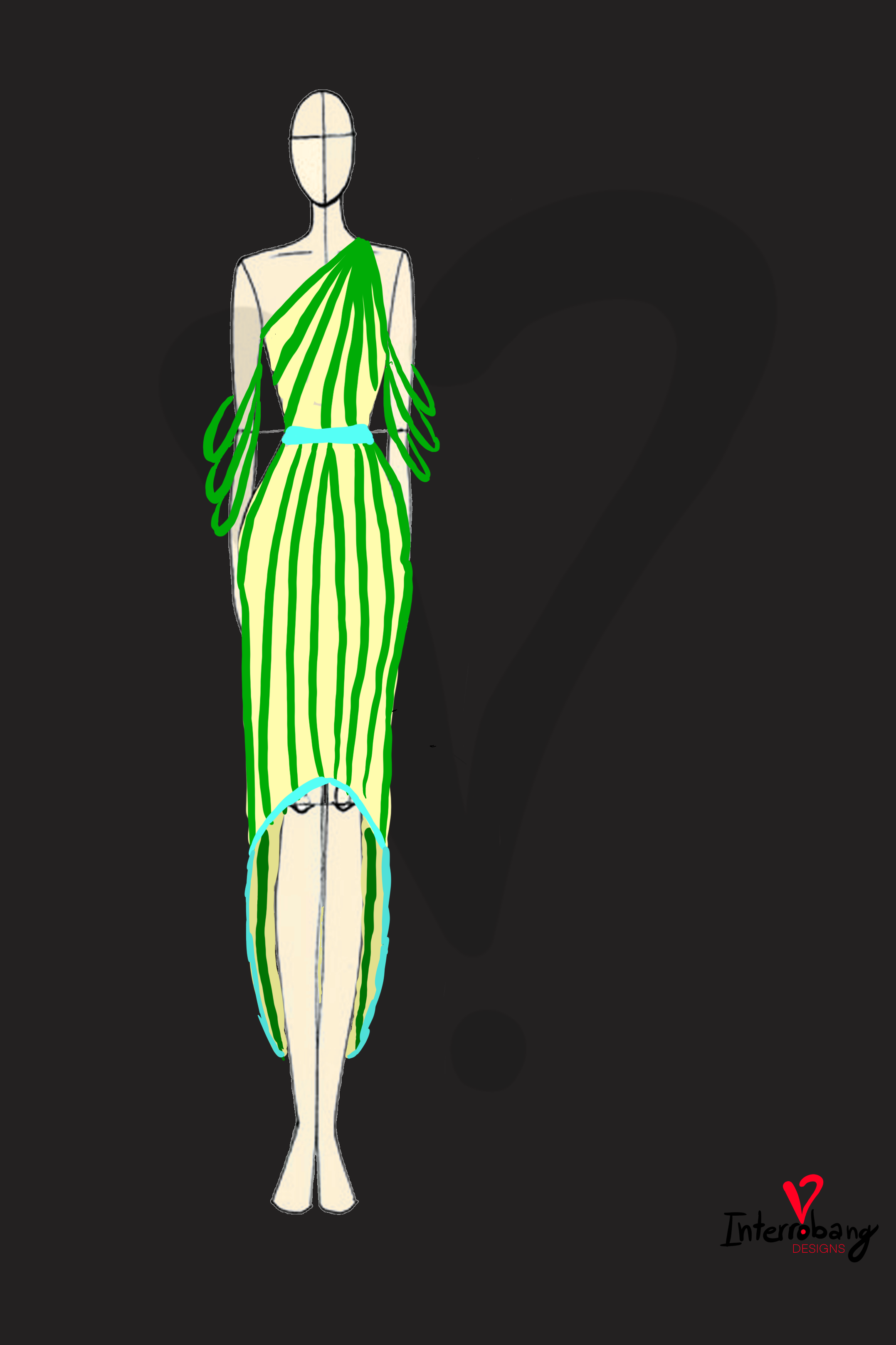
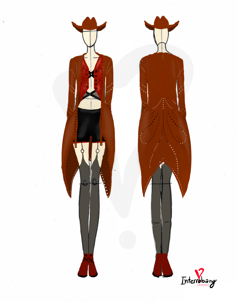
    The designs would put a twist on what’s conventional; street style meets tradionally proffessional clothing items, office attire with COLOR, an interplay between traditional structure of clothing and the fun, whimsy of the creative. It would not be bound by one “genre” of clothing and rather playfully jump between ideas of many subgenres of aesthetic and style.

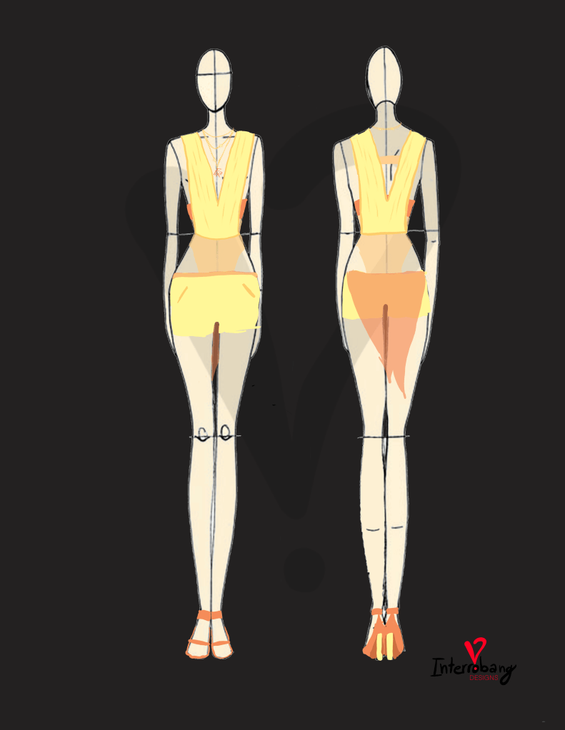
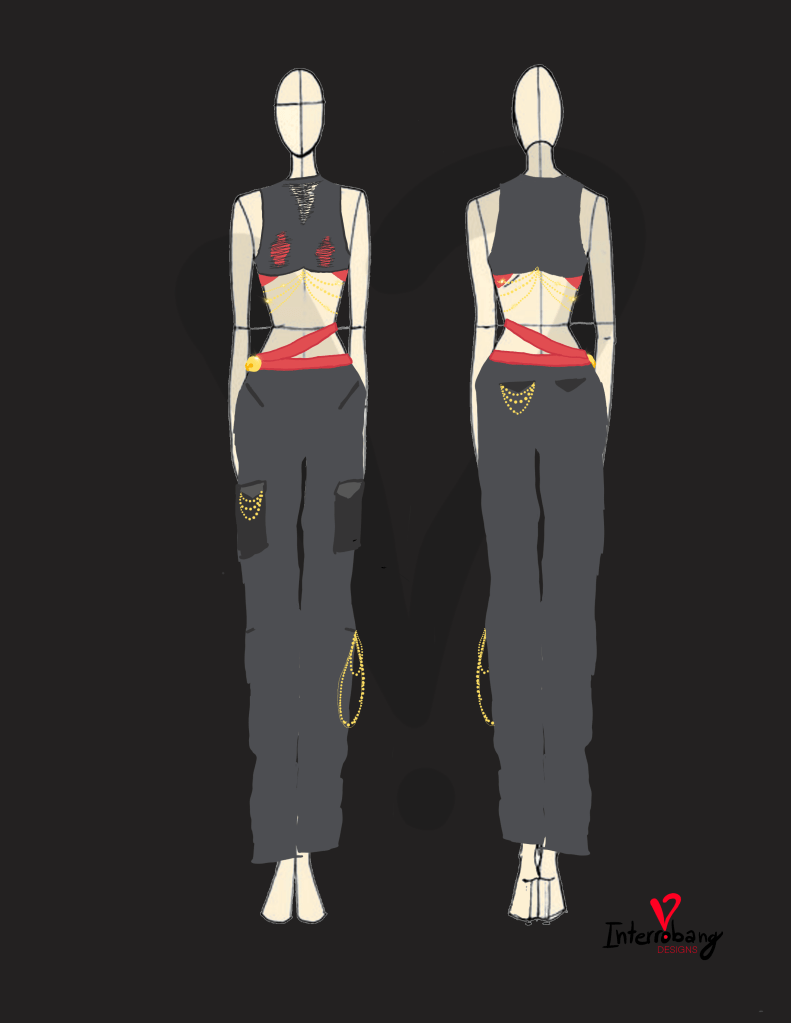
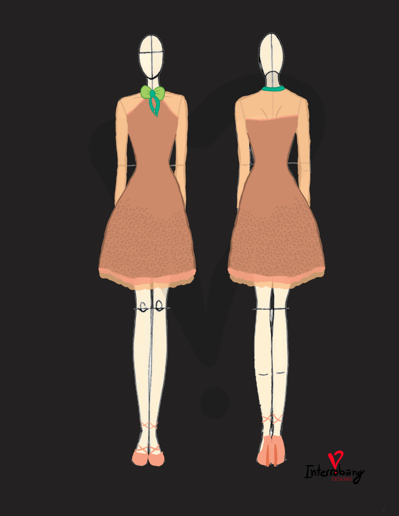
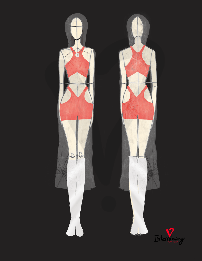
    Will every design in this section embody that? Probably not. This whole site is serving as a brain dump and archive of all my creative projects, not a finely tuned and refined fashion collection, BUT who knows, it could become the basis of something more in the future!

  • Nov 11th, 2025

    This design came from a challenge I tasked myself to on a work lunch break, what could I design in 30 minutes?

    The inspiration was Ateez’s version 1 lightstick

    The base of the design was built around the hourglass in the center, with the “sand” represented with sequins. The boots are a nod to the black base of the lightstick, and under the hourglass portion there is a white mesh with a grid-like texture as a nod to the globe of the lightstick.

    This isn’t necessarily a design I’m ~super~ proud of but given the premise of the self-assigned challenge I’ll let it exist as is! And if you want to see the process of this design you can watch the clip I posted on tiktok 🙂

  • Nov 5th, 2025

    This trio of designs came to be after Hongjoong announced his first fashion show titled Petit Coussin, which you can read more about here. He stated the designs and concept derived from his childhood. At the time of designing these that was all the info we had for the concept, so… I took that idea and created three designs off of core memories from ~my~ childhood

    Cards

    Growing up my family and I would play cards. It was one of the times we could all sit around a table and just be present with each other and some of my happiest (and most frustrated when I’d lose) memories centered around a deck of cards. With this design each of the card suits is present the clubs are the straps of the dress, the heart is the base of the bodice, an upside down spade acts to link the bodice to the skirt, which is comprised of five diamonds. I also added in some detailing on the heart to reference the back of a traditional Bicycle brand deck of playing cards

    Monkey Bars

    My youth constantly consisted of calluses on my hands from dangling on the monkey bars at recess. Here is a design tying in the visuals of monkey bars alongside the “weightless dangle” of the segments on the sleeves!

    Doodling

    Growing up nearly every page of my school work and notes had doodles on it. I wasn’t one to easily ‘lock in’ and pay attention by taking legible notes and looking at the whiteboard, I often times would end up doodling while listening and would later be able to look at parts of the drawing and remember what the teacher was talking about in class while I was drawing- it became my own personal form of notetaking! This design incoroproates the chaos of sketching on the blazer and pants, while the vibrant lapel and cuffs exploding out past the bounds of a traditional silhouette are supposed to symbolize coloring outside the lines! (and cyan, magenta, and purple were my favorite colors when I was a kid!)

  • Oct 6th, 2025

    I wanted to challenge myself to create a set of designs in a day inspired by the Aniteez characters!

    JJOONGrami

    Think scrappy but chic! I’m imagining patches with frayed edges (like the fluff of fur on the character), with sparling gem elements speckled about (like what a squirrel would collect), topped off with an acorn shapped beret hat!

    DDEONGbyeoli

    In the words of Seonghwa himself, sleek & sexy. The transparent ribbons are a nod to bunny ears as well as the neckline of the top. I think bunnies are cute yet elegant and when I think elegance I think ballet, so the back of the top has a nod to the tying of ballet ribbons.

    TYUdeongi

    I think Yunho I think a dapper gentleman, throw in some golden retreiver vibes and you have this suit! The lapels have a playful texture as a nod to the tail design on TYUdeongi and I’d want it to be loose enough of a fit that it’d still allow for someone to move around and dance freely in it!

    HETmongi 

    Much like the fluff of a maltese dog’s fur and the droop of the ears on HETmongi I wanted to echo that in the design with subtle ruffles and dropping sleves and structured ribbons spiraling down the back.

    SANdeoki

    She’s a princess to San and a princess to me! Featuring a sweetheart neckline off the shoulder top with ruching along the front and a delicate corset (shoutout San’s waist) with velvet floral designs, paired with a miniskirt with a soft transparent pleat peaking out under. I wanted to aim for cute, spunky, and a touch of royal elegance.

    bbyongMING

    This design is leaning towards swimsuit and coverup with a touch of sass. The back of the shorts has a transparent orange part of fabric to emulate the lovely tail feathers on a chick, and I couldn’t NOT incorporate an element of Mingi’s signature saying so I worked in his Fix On logo as a part of a long necklace.

    WOOYOnyang

    I was going for Wooyoung’s general inclination towards more street fashion meets a hint of feminine sass with a layered belt featuring the bell of WOOYOnyang’s collar, and several pieces of jewelry tucked in to pockets in the cargo pants (almost is if they were snagged and tucked into pockets quickly). The top also features some intentional rips as honestly I feel like WOOYOnyang would be the type of cat to scratch up some fabric but in a stylish way

    JJONGbear

    and last but not least

    As a nod to the modesty that Jongho tends to embody, this design keeps it classy with a high neckline and mesh sleeves. That same mesh is echoed in the bottom of the skirt under a layer of delicate pink lace on the hem. The green bowtie is my take on incorporating the cute little leaf sprout on JJONGbear’s head!

  • May 29th, 2025

    This is what I imagine the album design for Golden Hour Part 3 (see below) would look like as a dress.

    You can see where I got the colors and general shape for the design! A few fun challenges with this one where

    – How to replicate the “tree ring” texture on the cover

    – How to artfully depict the beam of light down the center

    My solutions? Imagining a lightweight tweed fabric to make up the bulk of the dress and to create an embroidered bead chain to dangle from the blue neckline, anchor it down in the midpoint, and let it hang and extend down over the skirt portion (kinda like a belly button piercing)

  • May 2nd, 2025

    You may see this and think… San? well, similar to Hongjoong’s design this is inspired by how I see San as it pertains to my potential person-color synesthesia, below is my initial depiction.

    To me he’s well balanced and although he’d BUILT he’s actually quite soft and warm to me, hence the warm colors and general haze behind the above image.

    As for how that translates into the design… think go-go girl! I wanted something fun with a playful texture and pop of color, with some chiffon elements to echo the haze and blur behind the inspo picture! You’ll also see the motif of circles throughout the design in the blouse, shorts, and on the boots!

  • May 27th, 2025

    This one was a quick creation based off the visualizer they posted for Golden Hour Part 3

    Essentially the overcoat functions like the glass and would be similar to a raincoat (I just dunno how to draw that material lol) and the inside is inspired by what was inside the box!

  • May 22nd, 2025

    D-J-A-N-G-O
    This one feels pretty self explanatory lol I wanted to try and experiment with texture and a patterned cut out type vibe with the jacket while keeping circles as a bit of a theme throughout!

  • May 20th, 2025

    This one isn’t based off a song! It’s based off the square below which is basically how I “see” Hongjoong (apparently I may have person-color synesthesia so that’s where that came from lol)

    To me he’s bold, vibrant, and artistic. Hence the colors and paint splatter and chaos of the initial square. To me that translated to a bold and sharp silhouette with the same colors. And though it’s hard to see between the top and bottom is actually a white mainly transparent body suit that has a paint splatter pattern on it.

  • May 11th, 2025

    Here we have my interpretation of Don’t Stop. The feel of this song was intense and felt like “sexy combat” vibes to me 😭 (not sure why my brain went there but it did…) so we have some tie ins of chains and a crop top/shirt situation. There’s also suspenders with chains that dangle down as a nod to breaking free (not being tied down… aka not stopped 😗)
    I also chose green as the primary color because green means go… and if they’re saying “don’t stop” then obviously we go 🙂‍↕️🙂‍↕️