Now I’m not sure if this falls under artistry or design… I feel it’s both… but for organizations sake, it’s living with my art things!
The name of this site is Reese’s Peaces.
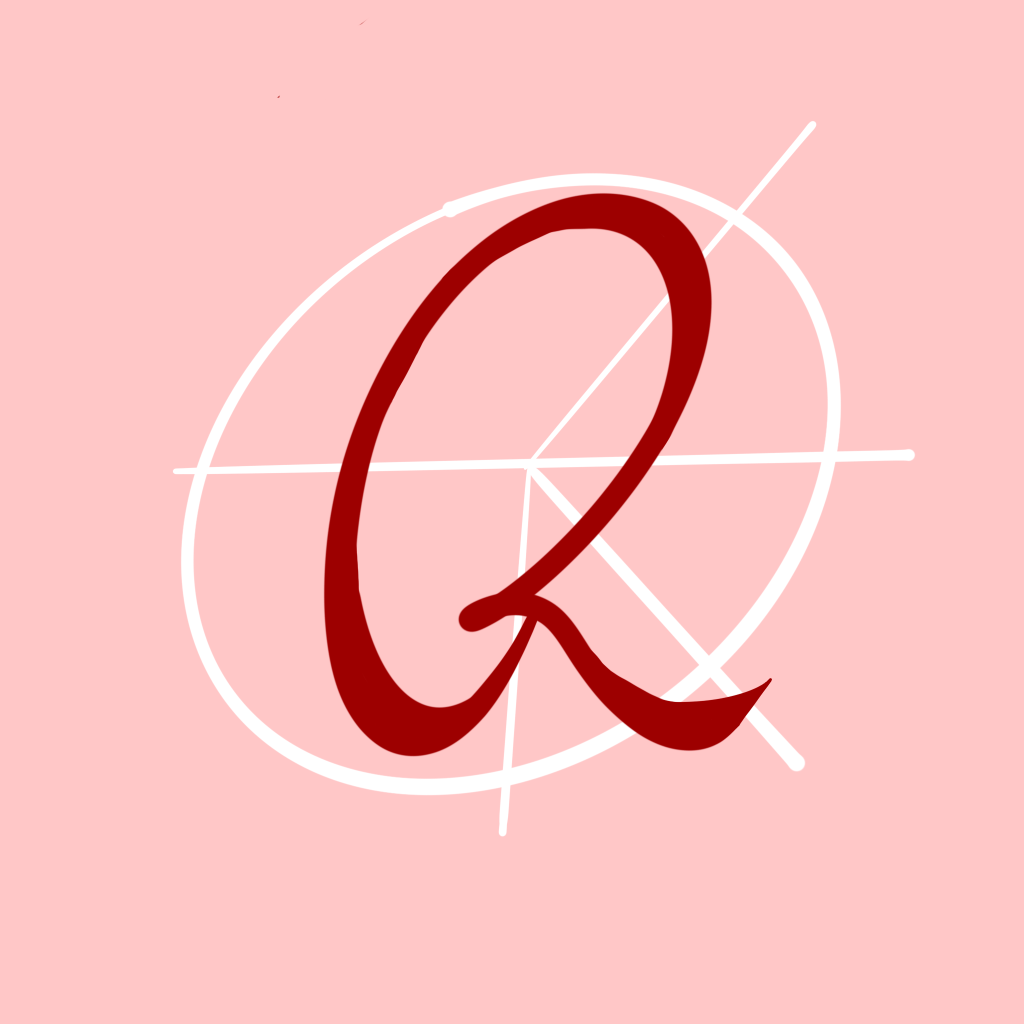
And here is the logo.
The ‘R’ is pretty self explanatory, my name is Reese, it’s part of the site. And the ‘font’ is my own handwriting and how I usually sign my name, leaving a mark upon the site.
The symbol in the back is a product of a touch of research and a desire to not be too ‘basic’ (not that there’s anything wrong with basic, that’s just not what I’m going for)
I wanted to tie in peace somehow but didn’t want to simply put in the peace sign ☮︎ behind my ‘R’
So I looked into how the peace sign came to be… and did you know it’s actually a symbol designed by an engineer and artist for the British nuclear disarmament movement in February 1958?
The symbol is a combo of the semaphore signals for the letters N and D, standing for Nuclear Disarmament.
SO, I took that idea and made it my own! I’ll let you guess the letters I chose to incorporate… just know it’s very core to who I am.

Leave a comment