This idea comes from the beautifully forlorn and yearning Ateez song Mist I wanted the colors to be beautiful yet muted and the shape to feel weightless like mist but also slightly… drooping? Like being pulled down by the anxieties referenced in the song. The white mist parts would be a ruffled chiffon type vibe and the beading along the neckline and sleeves would hopefully feel like raindrops/condensation dripping down.
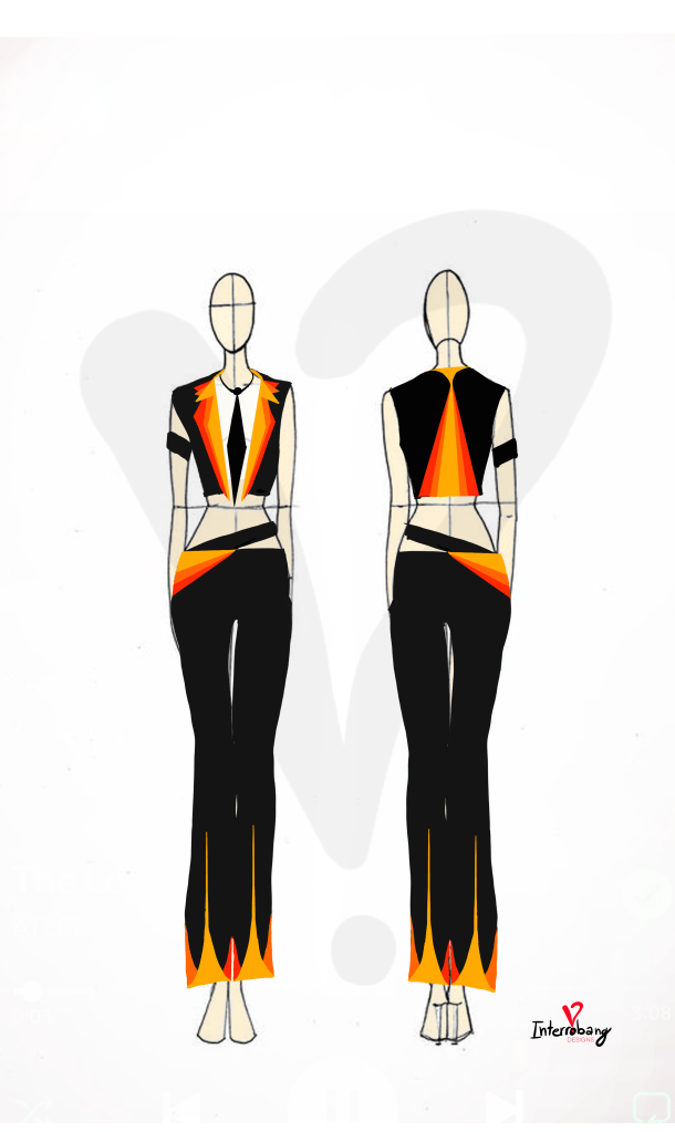
This one is inspired by The Leaders by Ateez, I drew inspiration for the colors from the album cover as well as a translation of a line in the song “The leaders, wow, we’re about to explode.” The idea came along with the reference to a “Black Suit and Tie” in Wooyoung’s line of the song, with colors exploding out from within. And of course I had to add an armband!
This was the first time I’d attempted to sketch out a design for any form of garment. I wanted to find a way to visualize the songs from the album and what style they emulate if they were turned into clothes!
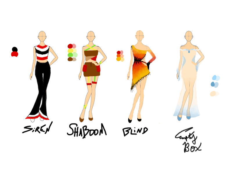
Siren: Think echolocation and old-timey radar meets fashion. I opted to have the main colors be red, black, and white because I think sirens, I think emergency, I think red. Black and white complement red well. The circular pattern echoes the sound waves that would come from the siren. As for the actual choice of shirt and flare pants…. I really like the song so I wanted to design an outfit I’d actually wear.
Shaboom: as the song itself takes some inspiration from Reggae I wanted the design to also tie into Reggae in some way. In order to do that I mainly used the color palette often associated with the genre of music (Red, Green, and Gold/Yellow). As for the desogn itself, I wanted it to be something that someone could dance in and I also wanted to give a nod to the genre mixing and overlap in the song by having some of the straps/acessories in the design criss-cross and connect.
Blind: the lovely flare of latin in the song simply had to become a salsa dress. The color scheme derived from the explosive nature of the later half of the song and I imagine the wearer of this design dancing across the club floor while the beads fly about embellishing every move of the hips.
Empty Box: this song in comparison feels far more muted and soft. The colors and design I went with are intended to echo that. Just like the box of memories from a failed relationship are to be packaged up and tucked away to fade from memory, the design itself fades to a muted blue as it extends to the floor.
For my birthday in 2025 my parents got me an IPad, and with that it opened the door to the ease of designing whimsical, fun, creative, (and sometimes illogical to ~actually create~ ) outfits.
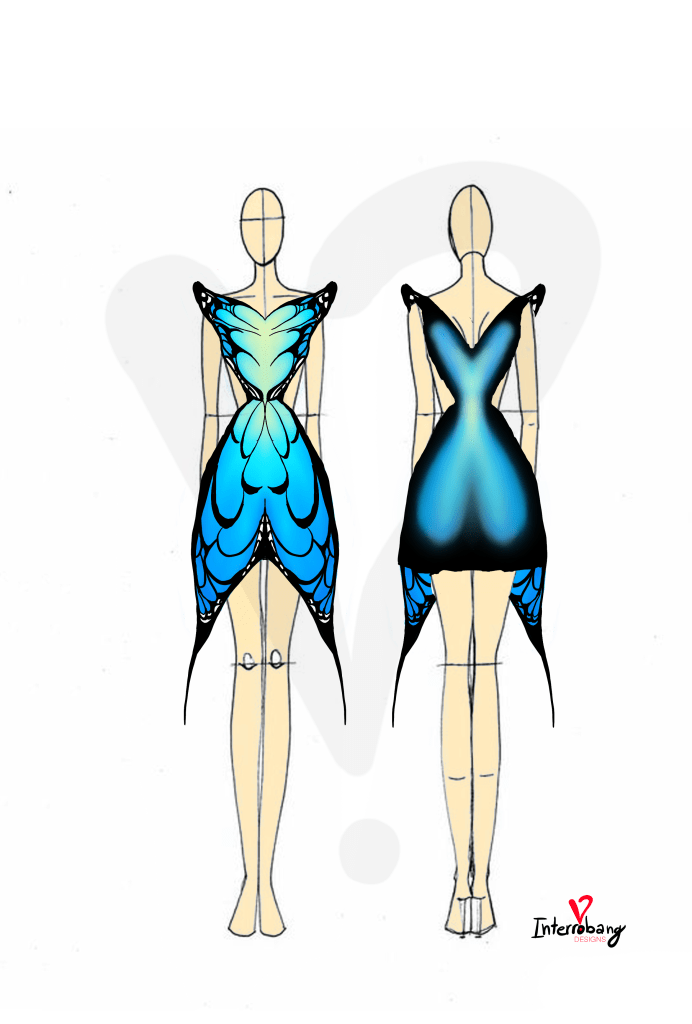
This was the first design I created based off (you guessed it) Ateez’s Dancing Like Butterfuly Wings. The color scheme took inspiration from the album cover and the design is pretty on the nose given the inspiration. This was the start of many designs inspired by Ateez songs, so keep poking around to see how I visualize the songs!
I’ve thought a lot about what I wish to leave in this world and why I feel such a strong urge to create, create, create, and try all the things my heart desires. So I’m starting this – a place to keep all my creations in one place and a creation in it’s own. It’s mainly for me to keep track of all the things I’ve got in my head, but you’re welcome to stick around and join me if you so desire!
I can’t promise I’ll be consistent but hey who truly cares, at least I’m trying!
Now I’m not sure if this falls under artistry or design… I feel it’s both… but for organizations sake, it’s living with my art things!
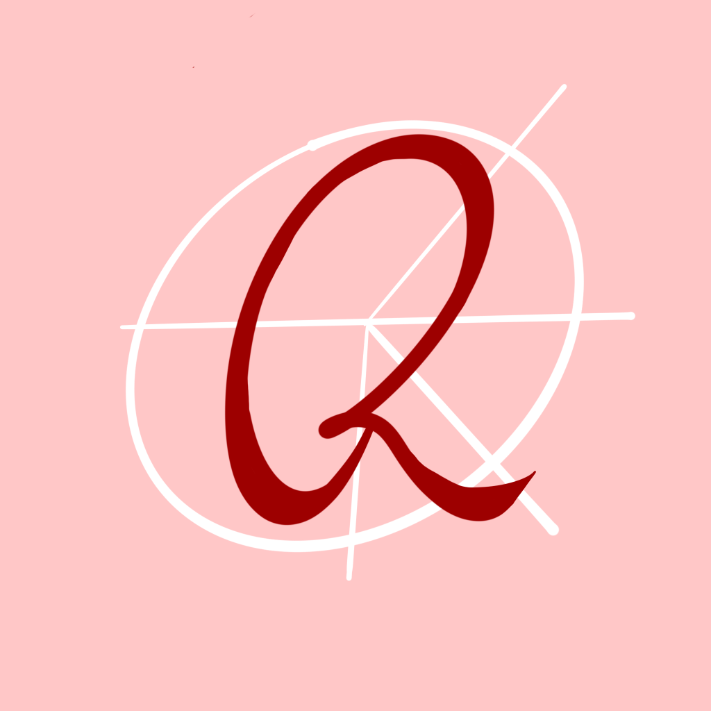
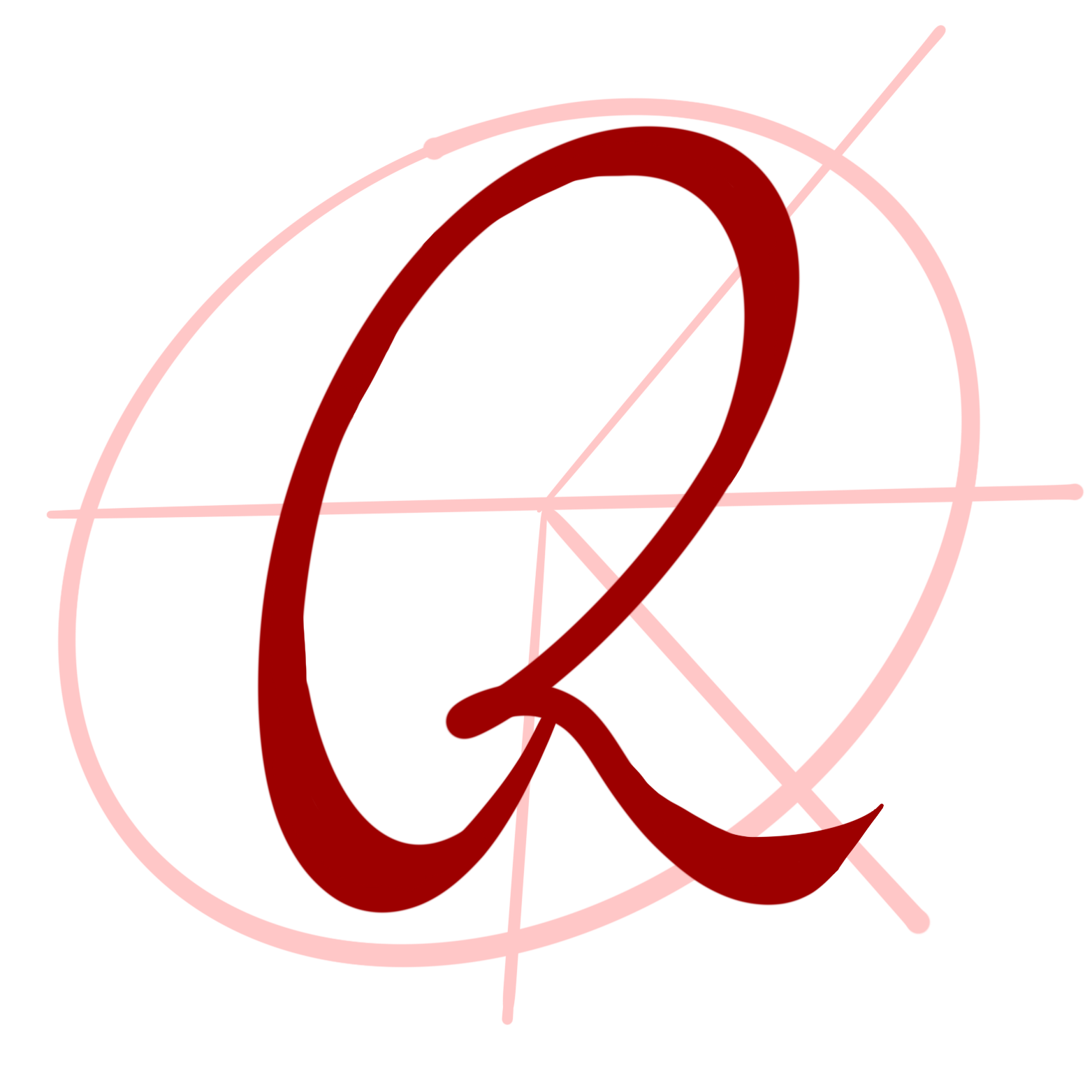
The name of this site is Reese’s Peaces.
And here is the logo.
The ‘R’ is pretty self explanatory, my name is Reese, it’s part of the site. And the ‘font’ is my own handwriting and how I usually sign my name, leaving a mark upon the site.
The symbol in the back is a product of a touch of research and a desire to not be too ‘basic’ (not that there’s anything wrong with basic, that’s just not what I’m going for)
I wanted to tie in peace somehow but didn’t want to simply put in the peace sign ☮︎ behind my ‘R’
When I leave this world I hope I’ve left my mark Let it be bright and light And shine through the dark
Let it live on in you for what I’ll leave shows through your mind in the ways you are kind to strangers to others to lovers but above all yourself
For when I leave this world please let my light live on through the glow of your smile more than once in awhile when you gaze upon a mirror or into another’s eyes
Let it glow and grow in the small moments you live the ones likely forgotten between the milestone memories
For when I leave this world I hope I’m never truly gone forget my voice forget my face forget my name but please remember The mark light I wish to leave